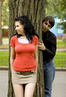

After dragging the images straight onto the work are of Adobe Photoshop, the first step was cropping the picture of the woodland area to get rid of the unwanted perimeter – now i had the base for my overall poster.
Next i used the magnetic lasso tool to help me cut around the individuals in each image. I prefer to use the magnetic lasso tool, rather than the other two tools (which are more freehand co-ordinated), as the points which construct the lines around the desired object automatically follow the outer shape of what ever is being cut, making it much more efficient – not so efficient for straighter edges though. I also used this tool to cut out any background imagery afterwards, which was left in between the legs the female for example. I then pasted and saved the newly cut images on new separate layers so i was able to easily alter each one separately.
Due to the shape of the tree (in the base image) which i had chosen for my stalker character (male individual) to hide behind, the two images didn’t fit very snug at first. The concave shape or curve of the tree trunk made it difficult to hide the man’s body behind convincingly, even though i had tried different positions. Instead i decided to use the ‘polygon lasso tool’ tis time, to precisely cut out a curved section of the area of the tree trunk which i then copied and pasted onto a new layer. I took this segment of the base image and positioned it in the gap which exposed the space between man and tree trunk. I then used the ‘smudge tool’ to blend the share edge of the new segment with that of the original tree colouring.
After placing the female image and the fitting the male image to the altered tree image, i only merged these layers together at this early stage as flattening seemed too permanent while I may still want to alter any of those specific layers before completing the overall poster. Now I was able to manipulate my newly created picture as one merged image.
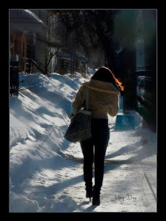
I began by clicking ‘Image’, then choosing ‘Mode’ to change the image mode to CYMK colour, enabling me to alter the individual levels of cyan, blue, magenta, and black within the overall image. With this I increased the levels of cyan (yellow) and black, as well as decreasing levels of everything else. I also liked the shadowy appearance of the background image and wanted to intensify it for the overall feeling of the radio drama’s story, so I increased levels of contrast, by going into ‘Image’ and clicking ‘Adjustments’. With a more dramatic contrast of light and dark, as well as the tan base – matched to the colour of the woman’s jacket, I decided to accent this tone with the same shade of blue in the man’s jeans. I increased levels of blue via the ‘Channel’ tab on the right hand side of the program. The magnetic lasso tool was again used to go around the female’s form, I then inverted my selection to the background around her shape, and selected the ‘Cross-hatch’ filter in the ‘Brush Strokes’ group within ‘Filters’ found at the top. I altered the length and sharpness of strokes to get the desired outcome. My previous step eliminated the female’s shape from taking on this new filter appearance, but I also did the space between her legs with the previously mentioned process.
Adding the text was done by selecting the ‘T ’ tool from the tool selection at the left hand side of this software. The use of this tool is especially for typing text – holding down the mouse and dragging outwards creates the text box that will hold the text. InDesign probably would have been a better software for this as it allows more spacing selections and general alterations for text, but a just used more text boxes for each line of text when I wanted vertical spacing between lines, very close together. As seen in the cluster of text saying…
“The Unseen” when the past refuses to move on… FRI 10 MARCH 9PM.
When I had decided on what text I wanted displaying, I played around with colours and text as art. The scheduling for the drama was displayed thus – ‘FRI 10 MARCH 9PM’. I copy and pasted this text layer so I had two versions “FRI 10 MARCH 9PM” and “FRI 10 MARCH 9PMcopy” one in blue font and the other in grey font colouring. I then positioned one layer on top of the other by positioning the order of the layers on top of each other in the list of layers displayed at the right hand side of the software. Blue, white, grey and orange were taken from the background and co-ordinated with each other within al the text, including the logo representing BBC Radio 4 that I dragged onto a new layer from the internet. By choosing ‘darken’, the translucency of the negative areas of the logo layer, so it blended nicely with the background image. This choice did affect the clarity in appearance of the numbers as part of the bottom section on the logo, but they were still legible.

No comments:
Post a Comment